Why These Three Variables Matter More Than Everything Else
Walk into a room that feels right and it's hard to explain why. Walk into one that feels wrong and it's equally hard to pinpoint. In both cases, the answer usually comes down to the same three things: colour, light, and scale. These aren't decorating preferences - they're the fundamental variables that determine spatial perception.
Most people decorate by accumulating objects they like. The result is often a room that feels busy, unresolved, or somehow smaller than it should. Understanding these three levers changes your approach entirely: instead of asking "what should I add?", you start asking "what is the room actually doing right now, and which variable needs adjusting?"
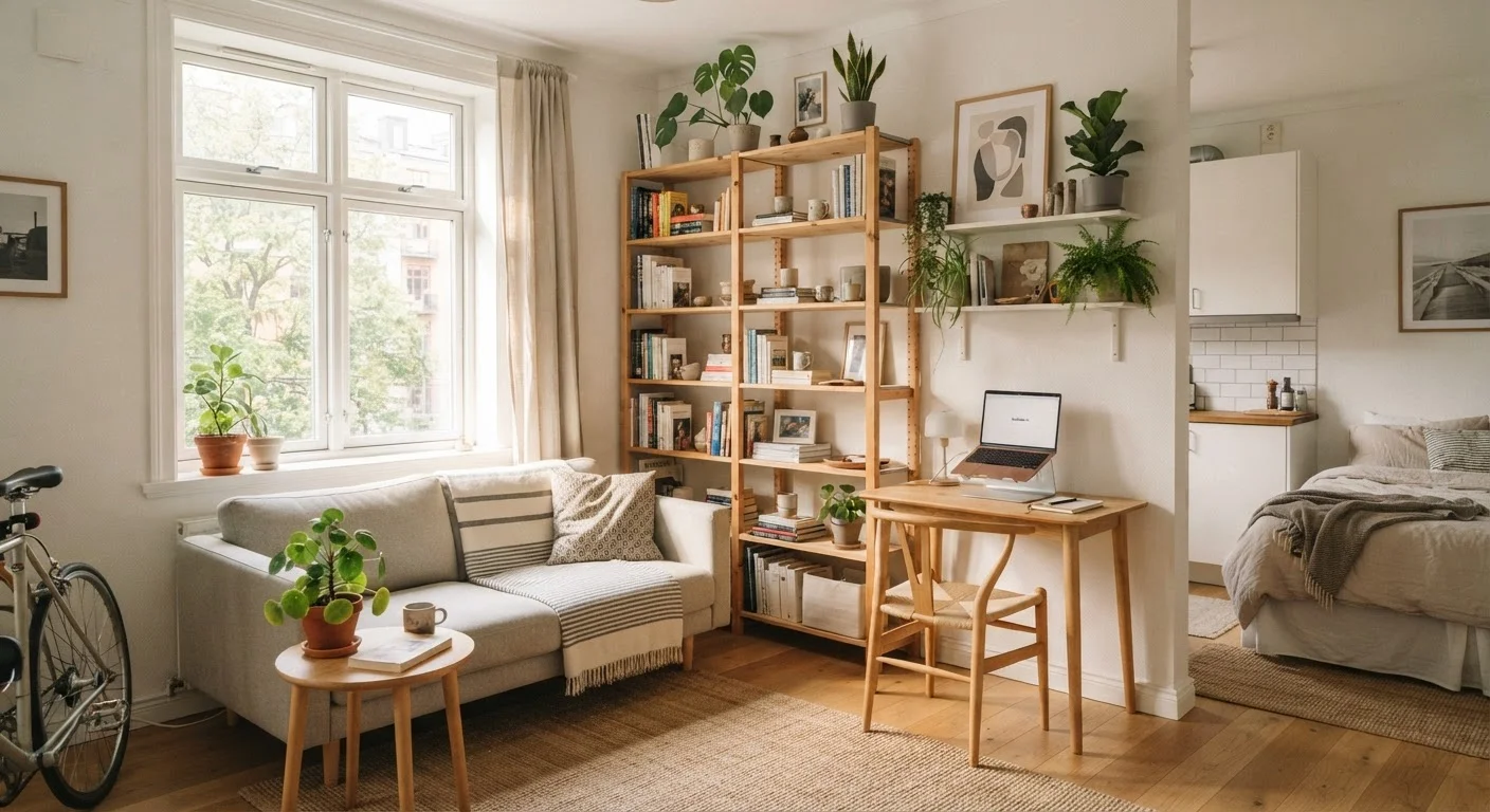
This framework is particularly useful if you're working with a rented flat, a starter home, or a limited budget. You don't need to gut a room to transform it. See our guide to making a first flat feel like home for context on building from scratch - but once you have a baseline, these three levers are where the real refinement happens.
90%
Of spatial perception is visual, not physical
Research in environmental psychology consistently shows that perceived room size is driven primarily by visual cues - light, colour, and proportion - rather than measured square footage.
2700K
Ideal bulb temperature for living and sleeping spaces
Lighting designers generally recommend bulbs in the 2700-3000K range for residential living areas to produce warm, relaxing light that complements most interior colour palettes.
18 inches
Minimum furniture clearance for traffic flow
Interior design guidelines commonly cite 18 inches as the minimum passable clearance between furniture pieces to maintain comfortable movement and prevent a room from feeling obstructed.
Colour: Value, Temperature, and Contrast
Colour affects a room in three distinct ways: its value (how light or dark it is), its temperature (whether it reads as warm or cool), and its contrast relative to other surfaces in the space.
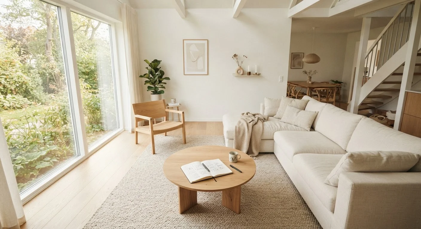
High-value colours - light creams, pale greys, soft whites - reflect light and visually push walls outward, making rooms feel more open. Lower-value colours absorb light and draw walls inward, which creates intimacy but can feel oppressive if the lighting isn't considered alongside it.
Temperature has an emotional dimension. Warm tones (ochre, terracotta, soft amber) tend to feel welcoming and energising. Cool tones (dusty blue, sage green, soft grey-green) feel calm and recessive - useful in spaces where you want to relax or concentrate.
Contrast is the variable most people overlook. High contrast - dark walls, light trim, bold accents - creates visual energy. Low contrast reads as serene and cohesive, but can also feel flat. A practical approach: reduce contrast in rooms where you want to wind down, and introduce it where you want to feel alert.
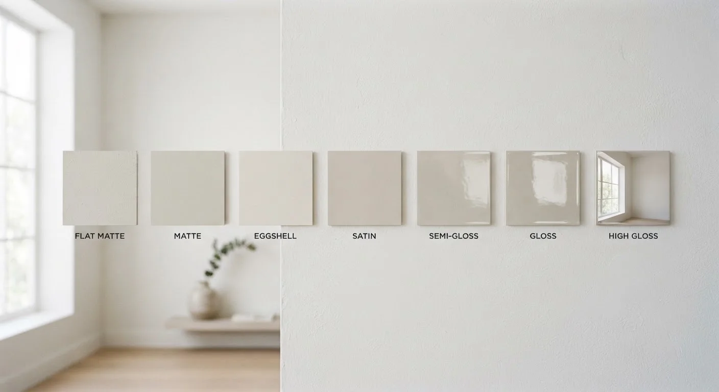
If you're considering repainting, understanding paint finishes is worth reviewing first - the sheen of a paint affects how colour reads across different light conditions.
Test Paint Colours at Night, Not Just in Daylight
Most people test paint swatches during the day and are surprised when the colour looks completely different after dark. Always view swatches under your actual artificial lighting conditions - evening is when you'll spend most time in most rooms. Paint a large sample patch (at least A4 size) and live with it for 48 hours across different light conditions before committing.
Light: Layers, Sources, and Colour Temperature
Most rooms in apartments and entry-level homes rely on a single overhead light - the design equivalent of eating every meal from one plate. Overhead lighting flattens a room, eliminates shadow depth, and creates a harsh, utilitarian feel regardless of how good the colour or furniture is.
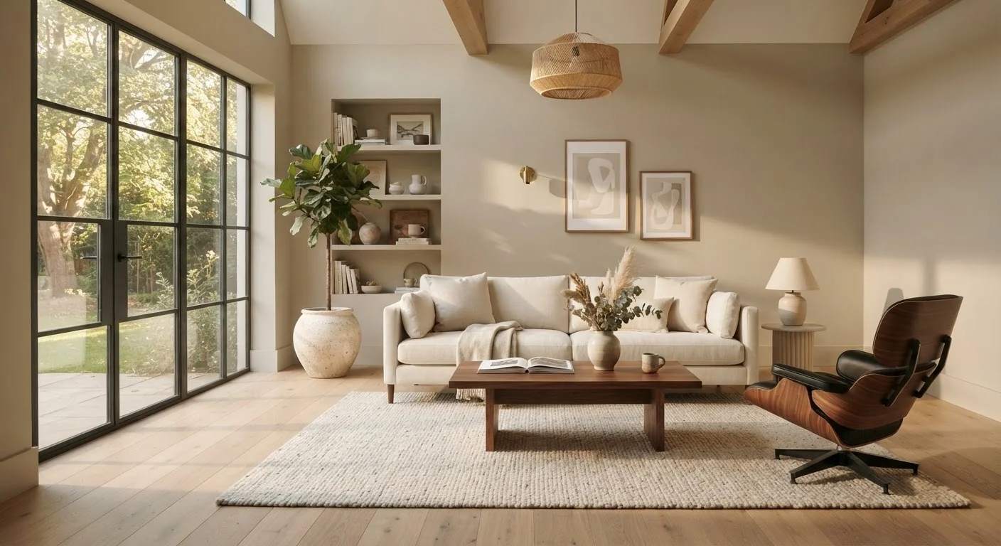
Effective lighting uses three layers: ambient (general fill light, often overhead), task (directed light for specific activities - reading, cooking, working), and accent (light that draws attention to features - a bookshelf, a plant, a wall treatment). Even adding a single floor lamp to a living room that only has overhead lighting introduces depth and warmth immediately.
Colour temperature - measured in Kelvin - determines whether light feels warm or cool. Bulbs around 2700K emit a warm, golden light suited to living rooms and bedrooms. Bulbs around 4000K-5000K emit a cooler, daylight-adjacent tone better suited to kitchens, bathrooms, and home offices. Mixing very different colour temperatures in the same room creates a disjointed effect.
Dimmer Switches and Rental Restrictions
If you're renting, check your tenancy agreement before replacing light switches or fittings - some landlords require written permission for electrical changes, even minor ones. In many cases, plug-in dimmer adapters or smart bulbs with adjustable colour temperature offer a no-modification workaround that gives you similar control.
Before redecorating any room, it's worth doing a lighting audit as part of a broader review. The room-by-room audit checklist covers light alongside function, flow, and storage - useful before committing to any changes.
Scale: Proportion, Clearance, and Visual Weight
Scale is the relationship between the size of objects and the size of the space they occupy. A sofa that's the right size for a 400 sq ft living room can make a 200 sq ft room feel like a hallway. A coffee table that works in a large open-plan space can make a compact room feel maze-like.
Visual weight is a related concept: dark, heavy, or large-patterned pieces carry more visual mass than light-coloured, slim-legged, or minimally detailed ones. A room can be physically uncrowded but feel dense if the visual weight is unevenly distributed.
A few practical calibration points:
- Leave at least 18 inches of clearance between major pieces of furniture and high-traffic paths.
- In a room with low ceilings, favour low-profile furniture - it draws the eye horizontally rather than emphasising the ceiling constraint.
- Rugs anchor a seating area visually; a rug that's too small makes furniture look like it's floating disconnectedly.
- Vertical elements - tall bookshelves, floor-to-ceiling curtains - draw the eye upward and make ceilings feel higher.
For smaller rooms specifically, the principles behind small-space organization extend the scale discussion into layout and storage logic.
Putting the Three Levers Together
These variables don't operate independently. A very dark wall colour in a poorly lit room compounds both effects. A large sofa in a warm-toned room with layered lighting might feel cosy rather than cramped. Changes to one lever often reveal the need to adjust another.
A useful diagnostic: if a room feels wrong, identify which of the three is most out of alignment before making any purchases. Is the light flat and overhead-only? Is the colour contrast fighting itself? Is one piece of furniture out of proportion with everything else? Fixing the actual problem is almost always more effective - and more affordable - than adding more objects to the space.
For budget-conscious approaches to actioning these insights, decorating on a tight budget covers colour theory shortcuts and focal-point strategies that work within these three levers without heavy spending.
“Light is not just something that allows you to see a room - it is the single biggest determinant of how a room makes you feel. Get the light right and everything else becomes easier.”
— Ilse Crawford, Interior designer and founder of Studioilse, known for human-centred design practice