The Real Reason Shelves Look Messy
Most people assume cluttered shelves are a volume problem - too many things, not enough room. In practice, stylists rarely focus on quantity first. The more common issue is that objects are placed without any organizing visual logic, so the eye has nowhere to settle. The result feels busy regardless of how many items are actually present.
Understanding why this happens matters because it changes how you fix it. Removing half your things might help temporarily, but if the underlying visual principles aren't in place, the shelf will drift back toward chaos. The goal isn't minimalism for its own sake - it's intentionality. As research on organized environments shows, visual disorder creates genuine cognitive load, and shelving is one of the most visible surfaces in any room.
The mistakes below are the ones stylists correct most consistently - and each one has a practical fix you can apply without buying anything new.
Filling every inch of available shelf space.
Why it happens: It feels wasteful to leave empty space, especially in smaller homes where storage is at a premium. People default to using every available surface.
Lining up objects at the same height across the entire shelf.
Why it happens: Uniformity feels tidy in concept, but a flat horizon line reads as monotonous and actually draws attention to any slight inconsistency in the row.
Mixing too many unrelated colors and finishes across a single shelf.
Why it happens: Objects are often collected over time from different sources, so there's no inherent color logic to what ends up displayed together.
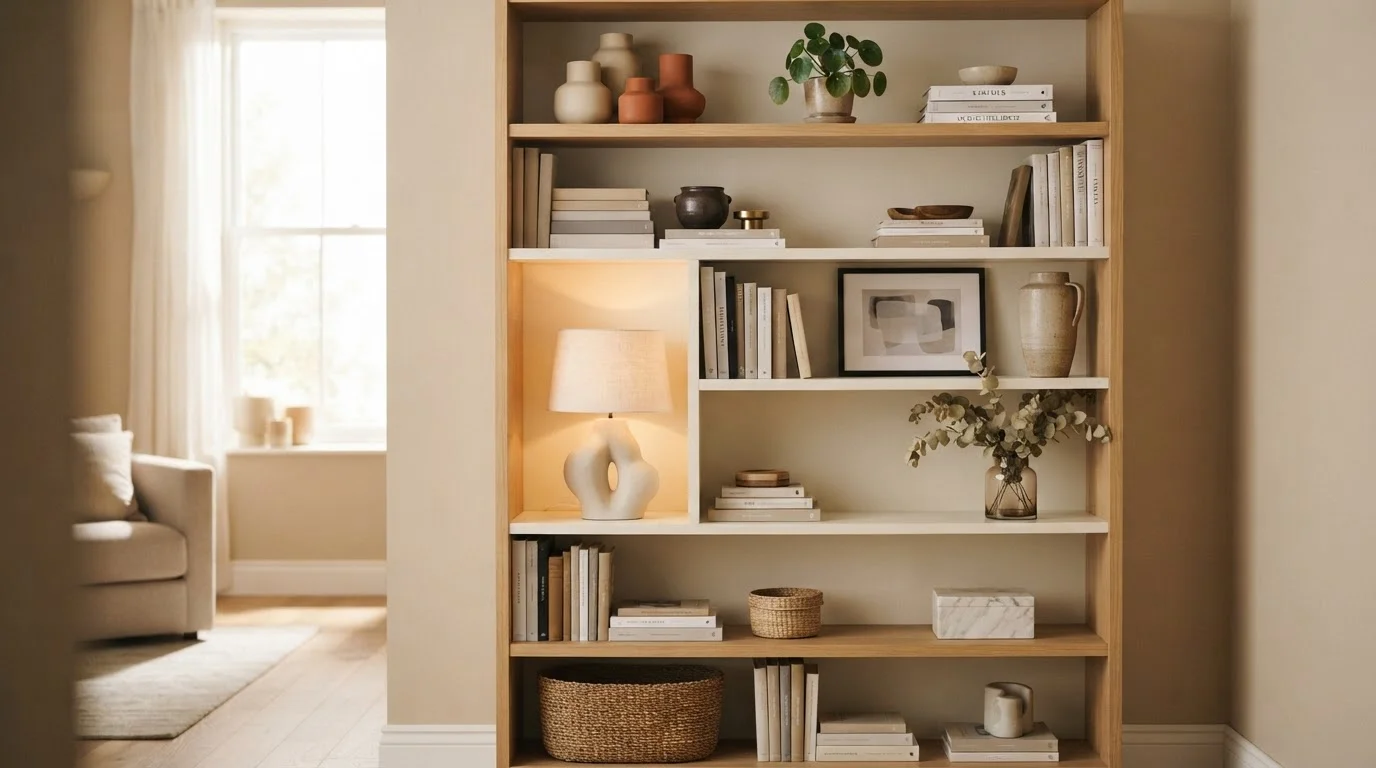
Treating every shelf on a unit identically.
Why it happens: When styling a bookcase or shelving unit, it's tempting to apply the same formula to each row for consistency. In reality this creates visual repetition that makes the whole piece disappear into the wall.
Ignoring texture and relying only on shape and color.
Why it happens: Texture is the hardest visual quality to plan for because it's subtle in isolation - it only registers clearly when contrasted against something smooth or matte.
Displaying every item rather than editing for display versus storage.
Why it happens: There's an implicit assumption that open shelving is for showing things, so everything ends up on view. The line between display and storage gets blurred.
Applying the Principles: Where to Start
Once you understand the mistakes, the path forward becomes clearer. Begin by pulling everything off one shelf at a time rather than tackling the whole unit at once. This lets you see each shelf as a contained composition rather than a single overwhelming problem.
~30%
Recommended empty space per shelf
Interior styling guidelines consistently suggest leaving around a quarter to a third of each shelf visually open to avoid a crowded appearance.
Odd numbers
Grouping rule for decorative objects
Groupings of three or five objects are a widely cited principle in visual merchandising and interior design, as asymmetry creates more natural-looking compositions than even-numbered pairs.
From there, build in layers: establish anchor pieces first (typically the tallest or most structural items), then add mid-height objects, then finish with small accents. Leave at least one-quarter of each shelf visually empty - that breathing room is what makes the rest read as curated rather than crammed.
Color is a powerful unifier. Grouping books by spine color, or keeping decorative objects within a limited palette of two or three tones, immediately reduces visual noise even when the number of items stays the same. For a deeper look at how proportion and color interact across an entire room, the principles in Colour, Light, and Scale apply directly to shelf styling as well.
If you're working with a first apartment or building a shelf display from scratch, Making a First Flat Feel Like Home walks through how to layer storage and style together when your budget and inventory are both limited. And if open kitchen shelving is part of your space, be aware that the styling rules shift slightly - open shelving in kitchens carries its own trade-offs worth weighing separately.
Don't Over-Style Into Sterility
Applying these principles too rigidly can result in shelves that feel staged rather than lived-in. The goal is visual calm, not a showroom. Leave room for a few personal, imperfect items - a favorite book placed face-out, a small object with sentimental value - to keep the space feeling genuinely yours.